

Top Resume Fonts to Increase Your Job Application Success
In today's competitive job market, the details of your resume can decide when landing your following job interview. Among these details, the font choice can significantly impact how hiring managers perceive your application. A recent study sheds light on hiring managers' preferences regarding popular resume fonts, highlighting critical elements that can enhance the presentation and readability of your resume. This document often acts as your first impression with employers.
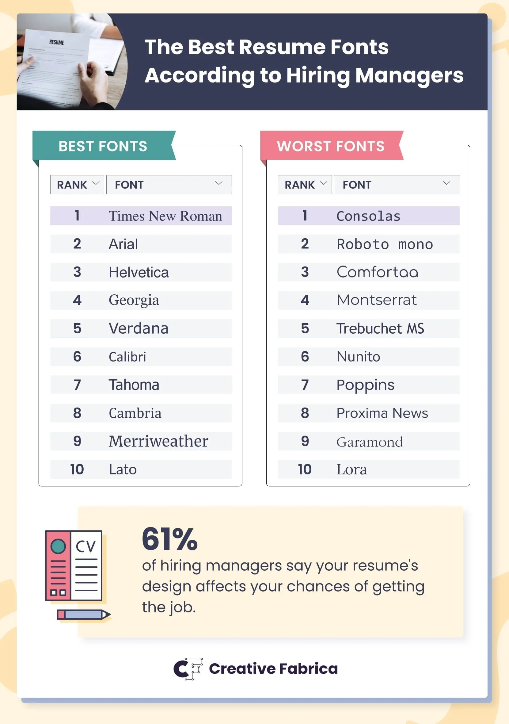
The study reveals that fonts such as Times New Roman, Arial, and Helvetica consistently rank as the top choices for resumes. These fonts are favored for their readability and professional appearance, which are crucial when recruiters and hiring managers, often pressed for time, scan through numerous applications.
Times New Roman
A classic serif font has been a staple in professional documents for decades, conveying formality and reliability. Its widespread use across various platforms and print media makes it an accessible and versatile choice, particularly favored in traditional industries like law and academia. On the other hand, Arial is a sans-serif font that provides a clean, modern look. It’s widely used in digital formats and is known for maintaining readability across screens of different sizes. Arial is particularly effective when space is limited on a resume, as it allows maximum information to be presented without overwhelming the reader.
Arial
Arial is a common sans-serif font designed in 1982 by Robin Nicholas and Patricia Saunders for Monotype. It features a clear and modern appearance. It is widely used in print and digital media and is favored for resumes due to its readability and professional look. Arial's simplicity ensures clarity at small sizes, effectively highlighting key information. Its neutral style suits most industries, offering a stylish yet organized presentation. As a standard font on most computers, it ensures consistency across platforms.
Helvetica
Another sans-serif option is celebrated for its aesthetic appeal and clarity. Designers and professionals in creative industries often use it. Its sophisticated yet straightforward design makes it perfect for modern resumes, ensuring information is conveyed clearly and effectively.
The choice of font is more than just an aesthetic decision; it influences how easily the content of a resume is read and interpreted by both humans and machines. Approximately 70% of hiring managers reported difficulty reading resumes due to poor design choices, underscoring the importance of font clarity and layout. Additionally, many companies utilize Applicant Tracking Systems (ATS) to filter resumes before reaching a human recruiter. Sans-serif fonts like Arial and Helvetica often perform better in ATS scans due to their simple, clean lines.
The study emphasizes the impact of font sizing and formatting in addition to font choice. A standard resume font size is typically between 10 and 12 points for body text, ensuring that the document remains professional and easy to read. Larger font sizes are often reserved for section headings or the candidate's name to establish a visual hierarchy and guide the reader through the document.
Another aspect to consider is the medium through which a resume is viewed. With a growing trend towards digital submissions, sans-serif fonts are becoming more popular due to their superior on-screen readability compared to serif fonts. However, serif fonts can still be highly effective for printed resumes, where their traditional appearance lends a degree of sophistication and seriousness.
While the choice of font is vital, it is also essential to consider the overall design of the resume. A well-structured resume that is easy to navigate will likely be more effective than a visually cluttered document. Therefore, selecting a consistent font style and size, using bold and italic styles to emphasize key points, and ensuring ample white space can enhance clarity and readability.
The study suggests that decorative or overly stylized fonts, such as Comic Sans and Script, should be avoided. They are often perceived as unprofessional and can detract from the content of the resume. Instead, the focus should be succinctly presenting information, enabling hiring managers to easily identify critical qualifications and achievements.
In conclusion, the font you choose for your resume is integral to your professional presentation. Fonts like Times New Roman, Arial, and Helvetica are recommended for their ability to convey professionalism while ensuring readability and compatibility with digital systems. By selecting the right font, size, and format, you can significantly enhance the impact of your resume, improving your chances of making a positive impression on hiring managers. With over half of hiring managers acknowledging the effect of a resume’s design on their hiring decisions, paying attention to these details can make a substantial difference in your job application success.
Subscribe to our newsletter and explore insightful conversations on workplace culture, burnout, and leadership at the Breakfast Leadership Network, ranked in the top 20 globally. Join us to thrive in the modern work environment.
Please stay connected with us. Check out the Breakfast Leadership Show Podcast for more insights and valuable content. Join our podcast and get inspired by top industry leaders’ leadership lessons and success stories.

